April 2026
And some thoughts on bright shiny objects syndrome (SOS)

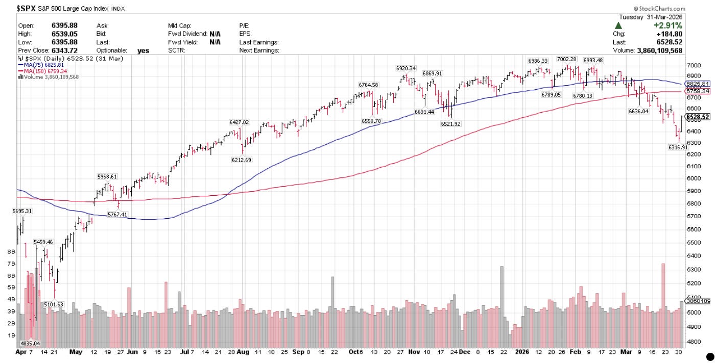
What a difference a month makes. Last month, I was busy opining on $SPX’s monthly close below it’s 200 day SMA. Not only did the world not end and the market not continue lower, but the exact opposite situation unfolded. I shared the chart below, with these comments:
“It will be interesting to see how the next few months unfold. My cynical guess is, that the market continues down just enough to cause the 50 day SMA to cross below the 200 day SMA, at which point all of the mainstream pundits and strategists will trumpet a “death cross”, at which point, it will be closer to a buy signal than a fresh sell signal. When this occurs is anyone’s guess.”
And here is April:
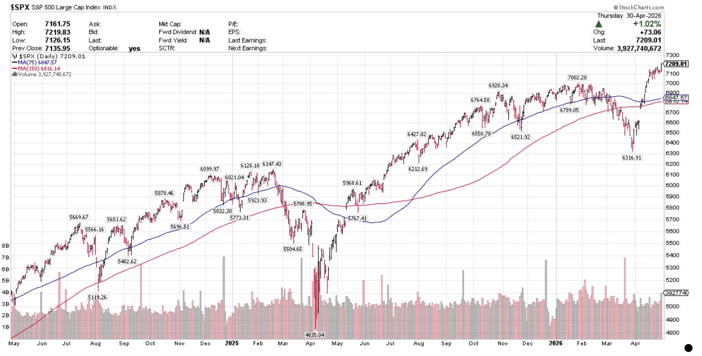
And this, my friends, is why I don’t dare base my approach on my own discretionary chart analysis (more on this later), and why I use a systematic approach based on the design of my own systems encoded and backtested in Amibroker.
By being systematic, I remove all discretion and emotion. Acting on signals generated by my systems is easier for me to follow than acting on my own discretion which, in the past has led me in emotional circles. I care only about following my own process than in getting the direction of any one single trade right.
Below are the system stats for April:
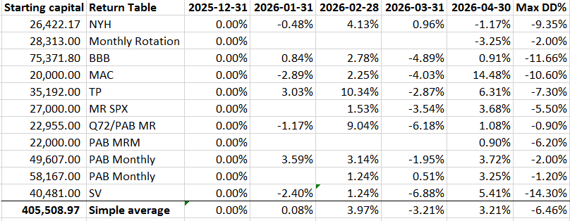
I have added Max DD% to the monthly return table in order to track this metric. I think it is useful.
I also realize that the simple average return likely overstates the aggregate returns across the systems, the return should be weighted based on the capital allocated to each strategy.
The best performing systems for the month were Trend Pilot and Moving Average Channel. Hindsight being 20/20, it would have been nice allocating more capital to these two systems from the get go, but I can’t think like this, as these systems might have just been lucky, while the other systems have not captured the right signals at the right times. Maybe TP and MAC will show worse performance in the future, and BBB and NYH will catch up? As I emphasized from the start of my blog, this is a real time experiment: I would like to see how all of the systems perform over one year before I make any decisions on whether to re-route capital or not. Month to month is likely just noise.
Some summary thoughts about the nature of each system I am trading, now that the systems have been live for almost three months.
A quick recap: I am trading six systems in Amibroker I designed. Four of these systems were inspired by reading Nick Radge’s Unholy Grails: these are long only trend following breakout systems with simple entry and exit rules. The fifth system was inspired by Cesar Alvarez and is a short term Mean Reversion system. The sixth system is a monthly momentum rotation system inspired by Matt Radke.
Each of the Amibroker systems uses an index regime filter to define when the system should and should not take trades. This should keep me out of trouble (knock on wood). The four long only trend following breakout systems use Amibroker’s built in position score ranking algorithm to rank trades when there are multiple signals. I have also added a ROC component to position score so that the system selects higher ranked ROC stocks relative to their underlying index. I found that understanding position score was one of the more complicated features in Amibroker.
I am also trading four external systems: PAL (Monthly Signals, MR and MMR), and Starvine mirror)
$SPX Mean Reversion System
This system has been live since February 23, 2026, has returned 2.04% since going live, with a Max DD of 5.50%. It has taken 37 trades, with 23 winners and 14 losers. The longest win was 16 bars, and the longest loss 32 bars. The average win is 4.83% and average loss is 5.50%.
This system uses a short term 15 day SMA as a regime filter and will not take new trades when $SPX is < 15 day SMA.
This system generates positive expected returns due to a larger number of winning vs. losing trades. It can experience long periods of non profitability when the market (and the signals) do not mean revert (bounce) from oversold conditions quickly. The system looks for a quick snap back from oversold conditions. The one characteristic I have noticed while live trading, is that losses can persist for some time: oversold can stay oversold and not bounce enough to trigger an exit, while the system continues to admit new signals and exits winning stocks quickly when they bounce. Another characteristic is that entry signals can cluster in the same sector or group of stocks (for example, defense stocks most recently all triggered buys and have continued lower since initial entry).
Since going live, I am satisfied that the system is performing in accordance with its backtest (2000-2024).
$SPX Bollinger Band Breakout System
This was my first system, has been live since January 7, 2026, and has returned .80% since going live, with a Max DD of 11.66%. It has taken 14 trades, with 7 winners and 7 losers. The longest win is 78 bars, and the longest loss is 74 bars. The average win is 12.88% and the average loss is 11.27%.
This system uses a long term 300 day SMA as a regime filter and will not take new trades when $SPX is < 300 day SMA.
This system generates positive expected returns due to an expectation of trend persistence after the entry signal. I have noticed that in live trading, the breakout condition above the upper band does not automatically translate into trend persistence for the signals taken thus far. Only 5 out of 14 signals thus far have shown trend persistence since initial entry. The other signals have fallen back below the initial entry point (inside the upper band) and have chopped around or exited since entry. I expect that for this system, the positive expected return based on the backtest history will result from a small number of breakouts showing trend persistence and returning outsized returns vs. the entries that go nowhere. That has not happened yet in the short three month history since going live.
$RUI Moving Average Channel System
This system has been live since January 23 and has returned 12% since going live, with a Max DD of 10.60%. It has taken 14 trades, with 9 winners and 5 losers. The longest win is 65 bars, and the longest loss is 11 bars. The average win is 24.71% and the average loss is 20.10%.
This system uses a long term 325 day SMA as a regime filter and will not take new trades when $RUI is < 325 day SMA.
This has been one of the stronger systems to date, along with the Trend Pilot system. This might be a function of the entry signal: close > 7 day moving average channel and wait 2 days, which might capture strong breakouts with continued momentum, vs. the BBB system which is more of a volatility based breakout. Thus far, I am pleasantly surprised by the results, but also cautious in that the system has taken numerous semiconductor name breakouts at the right time, which might just be good fortune/luck. Whatever the case, I am not complaining. As one very good trader friend (WG) once said to me, I would rather be lucky than good.
$RUI Trend Pilot System
This system has been live since January 26 and has returned 16.43% since going live, with a Max DD of 7.30%. It has taken 17 trades, with 8 winners and 9 losers. The longest win is 65 bars, and the longest loss is 34 bars. The average win is 26.26% and the average loss is 7.40%.
This system uses a long term 75 day SMA as a regime filter and will not take new trades when $RUI is < 75 day SMA.
Along with MAC, this has been one of the stronger systems to date. This might be a function of the entry signal: close > 75 day moving average channel and wait 4 days, which might capture strong breakouts with continued momentum, vs. the BBB system which is more of a volatility based breakout. Thus far, I am pleasantly surprised by the results, with the YTD performance driven by some really large moves in a few of the stocks admitted: TPL (since exited), VRT, VNOM, and most recently, RVMD and WCC. The distribution of signals is very different than that of MAC, in that no semiconductors seem to have been admitted.
$RUI New Yearly High System
This system has been live since February 2, 2026, and has returned .40% since going live, with a Max DD of 9.35%. It has taken 10 trades, with 4 winners and 6 losers. The longest win is 57 bars, and the longest loss is 58 bars. The average win is 10.72% and the average loss is 6.54%.
This system uses a long term 300 day SMA as a regime filter and will not take new trades when $SPX is < 300 day SMA.
This system generates positive expected returns due to an expectation of trend persistence after the entry signal, which is a close > 300 day high. Similar to BBB, I have noticed that in live trading, the breakout condition above the 300 day high does not automatically translate into trend persistence for the signals taken thus far.
Only 2 out of 10 signals thus far have shown trend persistence since initial entry. The other signals have fallen back below the initial entry point (below the 300 day high) and have chopped around or exited since entry. I expect that for this system, the positive expected return based on the backtest history will result from a small number of breakouts showing trend persistence and returning outsized returns vs. the entries that go nowhere. That has not happened yet in the short three month history since going live.
SOS (shiny objects syndrome)
Notwithstanding the April stats, my mind switches focus to the unspoken parallel between shiny object syndrome (SOS) and charting in the public arena. My humble opinion is that charts studied in isolation are useful in telling us on how things have unfolded. The constant attention to the study of charts to glean the future? Maybe not so telling in respect to how things might unfold. Maybe this is because I don’t trust my own brain as much as professional chartists/technicians trust their brains.
I use charts very carefully and sparingly. Perhaps a casual glance a few times a week at the majors, to see where price might be relative to the various SMA’s that are encoded into my systems as index regime filters. More likely, I am looking at my daily chart of the signals generated by my systems to ensure that the signals being generated are correct, i.e., for my $SPX Mean Reversion system, I check that RSI 2 < 15 for entry, & RSI 2 > 85 for exit for signals being generated to ensure that the system is doing what is coded to do. For this system, I am not looking for anything predictive in checking the signals, and thus do not care about the future.
An example: I have saved a chartstyle in stockcharts for my $SPX M/R system, complete with RSI(2) study, and in the bottom pane, $SPX with it’s 15 day SMA. I can visually audit the signals when they fire in Amibroker after market close vs. real time price unfolding. The challenge of course, is to not act on a visual signal intra-day until I actually get a signal once I run my code after market close, effective for the next day’s open. The entries are not the problem: the exits are: my old-self sees an RSI(2) > 85 and wants to exit the trade intra-day. The discipline is in not front-running the system by exiting the trade intra-day, otherwise I add a layer of discretion that did not exist during the backtkest. I have to be willing to accept the uncertainty between the visual intra-day RSI(2) > 85 and what may unfold the next morning with the order entered to exit at market. There may be a gap down. There may be a gap up. The system must be followed, and not the chart itself.
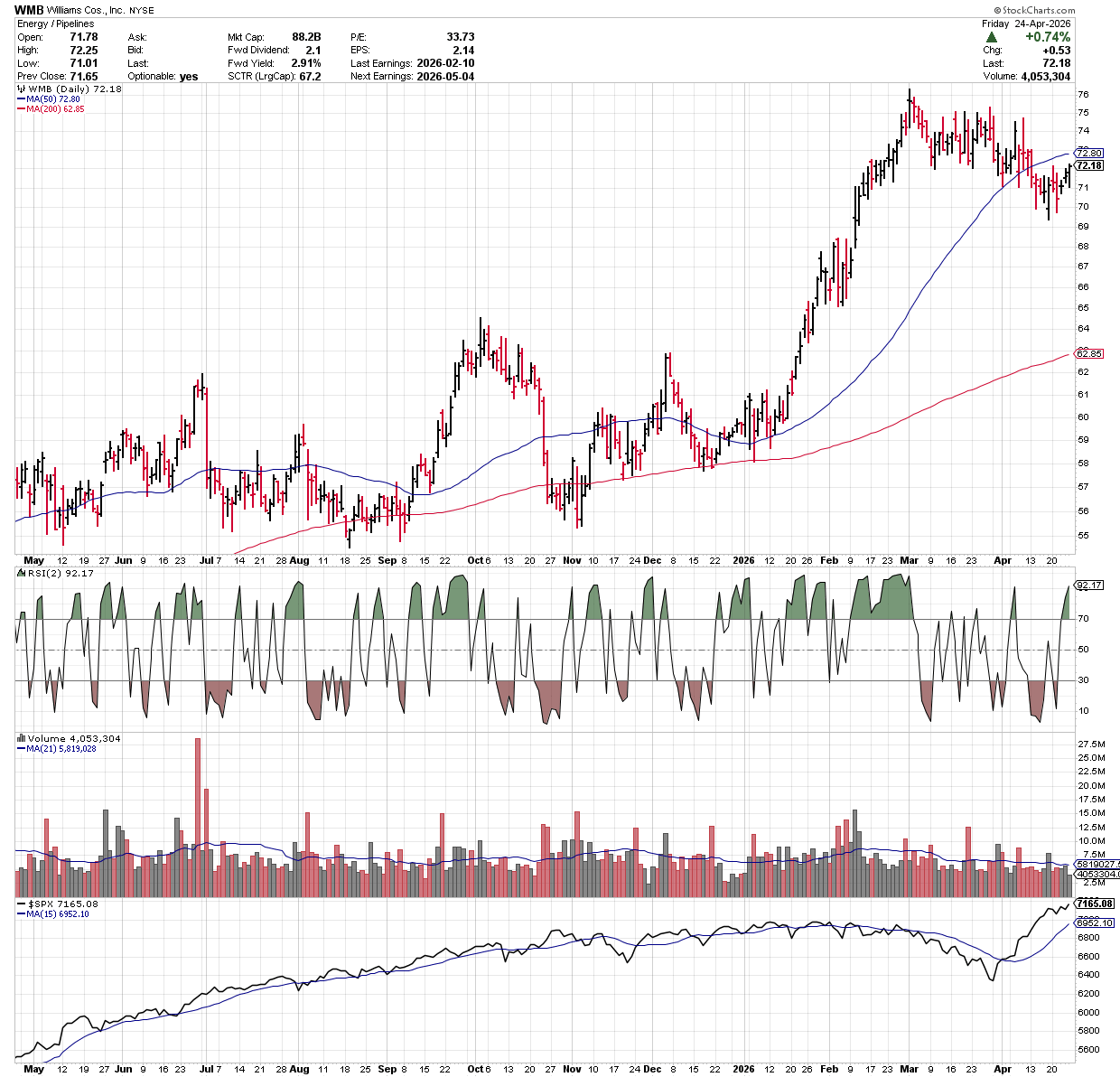
A live chart example for a signal I received on Friday April 24, WMB triggered an intra-day RSI2 > 85 on Friday, and I did not act. I waited until after the close on Friday April 24 and ran my $SPX M/R system to confirm the exit. The old Dan might have jumped the gun and put in a market on close order. I realize that by not acting, I am introducing weekend risk which could lead to a gap down on Monday. That is ok, because I am being true to the system and the system backtest by waiting.
I ran the code after the close on Friday and WMB indeed triggered an exit, and I entered a market order for Monday open based on the signal.
For my Trend Pilot, BBB, MAC and NYH systems, I am only concerned that the index is > it’s long term SMA, which is the built into each system as an index regime filter. I know that if this condition is true, then the trend is still up and the systems will take signals. In this case, I am somewhat concerned about the future, but only to the extent that the index is trending upward and should persist in that state.
I find that just staring at random charts does not provide me with much relevant context or insight: a popular chartist can present a collection of hand curated charts with hand-drawn support and resistance lines and channels, and patterns, and hypothetical patterns that have not yet completed, but might complete, if price goes one way or the other. And this chartist might get an overly enthusiastic congratulatory audience when calls prove correct, or when humorous comments are shared about said charts.
This tells me nothing about what the chartist is trading, what the entry signal was, what the exit signal might be, where the stop might be, what percentage of the chartist’s portfolio is tied to the chart or pattern being studied, or what the cumulative return, max DD, CAR, MAR, etc. might be from trading such chart, or pattern, or their portfolio of charts or patterns.
I’ve also noted lots of chatter these days from chartists and technicians about the sheer scale of the almost vertical $SPX ($QQQ is even more vertical!) bounce from end of March to the April highs, +9% in April, and close to +13% from the lows, after falling -5% the previous month, and -9% from it’s February highs. Interestingly, and zooming out, $SPX’s YTD return is approximately 4%, ignoring month to month fluctuations. Is a +9% $SPX monthly return in any one month “normal” historically? Put another way, how frequently does an $SPX +9% monthly return occur after falling > -5% the previous month? I did a bit of digging and found that there seems to be only five data-points going back to 1927 of $SPX up +9% after being down -5% (or more) in the previous month:
June 1931, after May 1931 (+20%, -11%), Oct 1974 after Sep 1974 (+16%, -12%), March 2009, after February 2009 (+9%, -11%), April 2020 after March 2020 (+17%, -13%), and July 2022 after June 2022 (+9%, -9%).
I don’t think anything can be statistically inferred from these results: these might have all been the tail-ends of reactions to certain crises or regime shift changes, where global markets were on tenterhooks during the declines, and something exogenous then happened to cause a reset and rebound in the subsequent month? Or, these might have been noise in otherwise noisy markets with elevated volatility at the time.
I’m sure many a chartist was drawing patterns and lines and channels, and drawing future conclusions about how the decline in Feb/March might play out, and were likely pleasantly surprised (or if bearish, the opposite) during the subsequent bounce in April. Did observing, inspecting and charting help manage risk at the individual security or portfolio level, or predict price accurately during these back to back periods? Some chartists will indubitably say “yes”, and that may be true but we will never know for sure. I watched one fellow who runs a YouTube charting channel, prattle on the other week, about how he told all of his subs to buy with both fists on March 30th. The same fellow also prattled on about shorting $WTIC at $80 during March with both fists. I’m sure he did both, bought the equity weakness on the precise day in March, and managed his short $WTIC book properly in order to preserve enough capital to buy equity weakness on the precise day in March.
And yet charting is so widely adopted as a legitimate study, but to what end if no other context is provided? To me, this type of diagnosis is a fun distraction, but akin to a coin flip. Heads price does this. Tails price does that. Heads, pattern completes. Tails, pattern fails. Nothing wrong with this if a trader goes into the study expecting a coin-flip outcome, and manages his/her risk properly in terms of position sizing, and entry and exit rules.
I would hazard a guess that the majority of folks trying to trade from charts/patterns alone don’t, and only the pros do, but the pros I’ve observed don’t typically provide much needed context, i.e., “I predicted this pattern to resolve before it resolved, I bet X% of my capital on this expectation, with an X% stop in case I was wrong, and this is trade #X this year on this particular pattern on this particular chart, and the win/loss ratio of previously close trades on calling this particular pattern has been X%, and the CAGR and MaxDD on trading this pattern resolution on this particular chart has been X% and Y% respectively YTD”. But man, do they get a lot of eyeballs when they make their calls, and get their calls RIGHT!
There is probably a lot more money to be made by being interviewed about past successful calls or running a YouTube channel, or being interviewed on financial news talking about charts and patterns and getting eyeballs there, than there is by actually trading off of a chart or a pattern resolving to the chartist’s satisfaction. After all, being interviewed and/or running a YouTube channel making calls, has no actual risk. On the contrary, eyeballs lead to clicks, which may lead to more followers, which may lead to paid subscriptions. It is all SOS.
(In defense of public chartists, a huge kudos to Tim Knight of SlopeofHope for being extremely transparent about his charting and his set-ups, failures, and victories in real time…one of the best public charts out there, if you can handle the bearish tilt, and to David Keller who runs Market Misbehavior, I always enjoy David’s updates).
And that is all I want to say about that.
In the context of evaluating my own performance month to month: My February stats showed an approximate 3.97% performance across my accounts. March stats showed an approximate -3.21% performance across my accounts. April stats showed an approximate 3.21%% performance across my accounts. My take away is that all of this occurred without any chart analysis or pattern resolution predictions on my part. The systems ran, and I took the signals. YTD, my combined simple un-weighted performance across the accounts is approximately 4.00%, with a combined un-weighted MaxDD of approximately -6.50%. I think I am slightly outperforming $SPX in terms of risk adjusted return, as my combined portfolio MaxDD of around -6.5% is lower than that of $SPX YTD at -9% from it’s February highs. It is still early days and only April. A lot can change between now and the end of the year.
I hope the above has been helpful to any and all readers.
Very good post